
Add Watermark to Image: Text or Logo, in Bulk
Protect and brand your photos with a text or image watermark, previewed live and applied to a whole batch at once.
Drop image files here, or click to choose
JPG, PNG or WebP · up to 50 files · 50 MB each · Ctrl+V to paste · nothing is uploaded
- Runs in your browser
- No upload, no account
- Free and unlimited
- No watermark
- Batch + ZIP download
Add watermark to image files in seconds with this free browser tool. Type your name or upload a logo, choose one of nine positions or a repeating tile, then set opacity, size, rotation, font and colour while a live preview updates. The same settings are applied to every photo in the batch, files keep their format, and nothing is uploaded.
How to watermark photos in four steps
1. Add photos
Drop JPG, PNG or WebP files, browse, or paste with Ctrl+V.
2. Design the mark
Type text or choose a logo, then pick font, colour and size.
3. Place it
Choose one of nine positions or Tile, and set opacity and angle.
4. Apply and save
Watermark every file and download them singly or as a ZIP.
What this free tool does
Words or artwork
Use your name, a URL or a transparent PNG logo.
9 positions or tile
Corner marks or a repeating pattern across the image.
Full control
Opacity, size, rotation, font, weight and colour.
Live preview
See the exact result on your first photo as you adjust.
Batch processing
Up to 50 photos with identical settings, then one ZIP.
Private
Everything runs in your browser; nothing is uploaded.
Who uses it
Photographers
Mark proofs before sending them to clients.
Online sellers
Brand product photos so copies point back to your shop.
Creators
Add a handle to images shared on social media.
Businesses
Stamp drafts, samples and internal documents.
Free vs Pro: what you pay for
Free · this tool
Add Watermark to Image
- Unlimited conversions
- Runs in your browser, no upload
- Batch up to 50 files and ZIP download
- No account, no watermark, no credits used
Pro credits · AI cloud tools
Enhance, upscale, restore
- Credits are only for AI cloud processing
- 5 free cloud credits every week with an account
- Charged only when a job succeeds
- Format tools like this one stay free
Why add a watermark?
A watermark tells everyone who sees an image where it came from. Photographers use it on proofs so clients cannot use unpaid copies, sellers use it so product photos lifted by other shops still point back to them, and creators use a small handle so reposts carry their name.
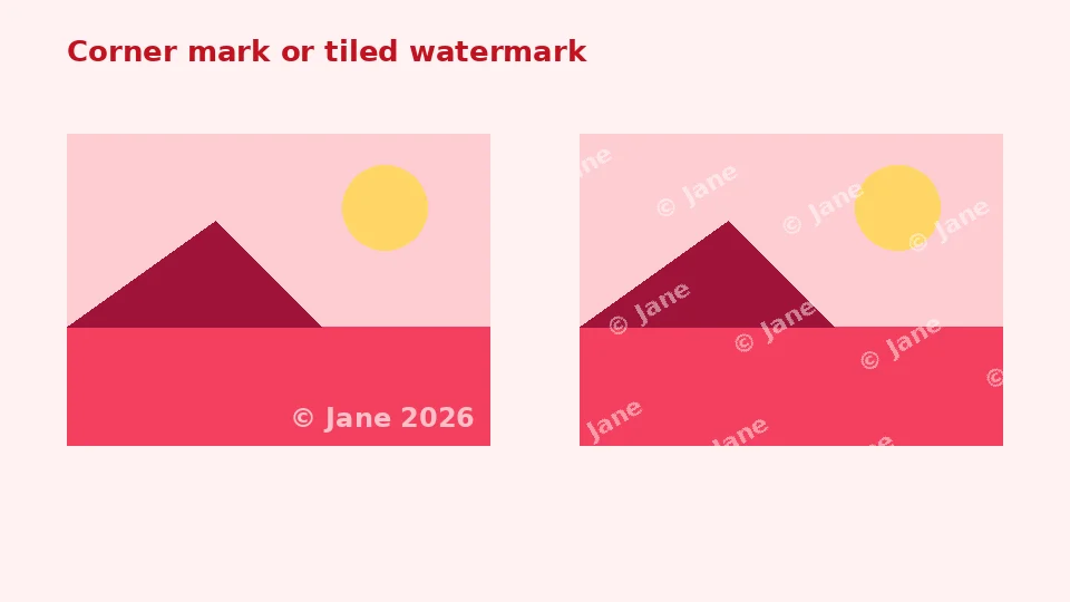
A mark will not stop a determined copier, but it adds friction and credit. A subtle corner mark keeps the picture enjoyable, while a tiled pattern makes reuse much harder.
Choosing a style
Text is quick and flexible: a name, a website or a short copyright line. A logo looks more professional and is instantly recognisable. Choose text when you want a fast, clear credit, and a logo when brand consistency matters most.
How to add watermark to image files here
Add your photos, then choose the Text option or the Logo image option. For text, type the wording, choose a font and colour, and decide whether it should be bold. For a logo, choose a PNG with a transparent background so only the artwork appears. The preview shows your first photo with the mark in place and updates every time you change a setting.
When it looks right, press Add watermark. Each photo is processed at full resolution with the same settings, so you can batch watermark photos for a whole shoot in one go and download them as a ZIP.
Positions and tiling
The 3 by 3 grid places the mark in a corner, at an edge or in the centre, with a small margin from the border. Tile repeats the mark across the whole picture in staggered rows, which is the strongest protection for previews. Size is measured as a share of the image width, so the mark looks the same on large and small photos.
Making a watermark that looks good
Opacity and colour
A transparent watermark between 30 and 60 percent opacity is visible without hiding the subject. White text works on darker photos and dark text on bright ones. For mixed images, a mid grey or your brand colour at lower opacity stays readable almost everywhere.
Logo files
To watermark with logo files, export your logo as a PNG with transparency and enough resolution, ideally at least as wide as the mark will appear. A logo saved as a JPG will show its white box, so a transparent version always looks cleaner.
Copyright lines
A copyright watermark usually combines the © symbol, your name and the year, such as © 2026 Jane Smith. Keep it short; long sentences become unreadable at small sizes. Rotation of around 30 to 45 degrees with Tile gives the classic diagonal proof look.
Formats, quality and devices
Output keeps the original format: JPG stays JPG, and PNG and WebP keep transparency. Files are drawn upright using their orientation tag, and the saved copy contains no camera metadata, which also protects your privacy.
To watermark photos on iPhone, open the page in Safari and pick images from your library, then save the results through the share sheet. Android works the same way in Chrome. On a computer, any modern browser can watermark images without Photoshop or any other paid software, and there is nothing to install.
Large batches
Very large photos take a moment each on older phones. For hundreds of images, process them in groups of 50 so memory stays comfortable.
Watermark tips that protect better
Placement matters
Corner marks are easy to crop out. If protection matters more than looks, place the mark over an important part of the picture or use Tile. For portfolios, a smaller corner mark is a fair compromise between protection and presentation.
Keep originals clean
Always keep the unmarked originals in a safe place and only share watermarked copies. If you later change your branding, you can watermark the originals again without layers of old marks.
Before sharing
For complete privacy, remove EXIF data before sharing to strip location details from any copies you made elsewhere, and blur faces or number plates that should not be identifiable.
Responsible use
Add marks only to images you own or have permission to publish. A watermark is a way of claiming credit for your own work, not someone else's. This tool adds watermarks only; EnhancerPro does not offer a watermark remover, because such tools are easily misused to strip credit from other people's work.
The tool is free, unlimited and private, and it does not use your EnhancerPro credits.
Ideas for different kinds of images
Portfolios and proofs
For client proofs, a tiled mark at 25 to 35 percent opacity and a 30 degree angle makes unpaid use unattractive while still letting the client judge the photo. For a public portfolio, a small mark in the bottom right corner at about 15 percent of the width keeps attention on the work and still credits you.
Product photos
Online sellers often place a small shop name or website in a lower corner. Keep it subtle so marketplace rules about clean product images are respected, and check each platform's guidelines, since some prefer images without any marks on the main photo.
Social media posts
A handle such as @yourname works well at the bottom centre, sized at around 20 percent of the width, in white with a little transparency. It survives most crops used by social feeds and stays readable on phones.
Documents and drafts
For drafts and samples, a large diagonal word such as DRAFT or SAMPLE in the centre, at low opacity, makes the status obvious. Use a bold sans serif font and a neutral grey so the content underneath remains readable for reviewers.
Consistency across a collection
When all images in a set carry the same mark in the same place, they look professional and instantly recognisable. Because the settings here apply to the whole batch, every photo in a shoot gets an identical watermark without any manual adjustment, and the size follows each picture's width automatically, so portrait and landscape shots match.
Fonts and readability
Simple sans serif fonts stay readable at small sizes and low opacity, which is why they are the default. Serif fonts suit fine art and wedding work, monospace gives a technical look, and Impact is bold enough for tiled proofs. If a handwriting style is not installed on your device, the browser substitutes a similar font, so check the live preview before applying.
Bold weight helps thin fonts survive compression on social networks. If your mark looks fuzzy after posting, increase the size slightly rather than raising the opacity, since a larger, lighter mark usually looks more refined than a small, heavy one.
Colour choices
White with 50 to 60 percent opacity suits most outdoor and dark images, while black at 30 to 40 percent works on bright studio shots. Brand colours look best when they contrast with the photo; a quick look at the preview tells you immediately whether the mark is readable or blends into the background.
Checking the result
After applying, open one or two of the saved files at full size. Make sure the mark sits where you expect on both portrait and landscape shots, and that it is readable on the busiest parts of each picture. If one photo needs a different placement, process it on its own with adjusted settings.
Frequently asked questions
Related tools
Need sharper, bigger or restored photos?
Our AI tools enhance, upscale and repair images for free on your device, with optional cloud processing on Pro credits.